

WIRED Editorial Layout


Project Brief
Client
WIRED is a monthly American magazine, published in print and online editions. WIRED magazine is the frontrunner when it comes to investigating, documenting and writing on technological trends effecting aspects of our daily lives, more specifically, business, culture, science and design. They pride themselves on uncovering breakthroughs and innovations that instigate new ways of thinking, new connections and new industries.
Deliverables
4 Page cover
16 Page inner
4 Advertisements
5 Articles
Full iconography set
Typography treatment
Full grid layout
All design imagery
Concept
A total of five articles were provided only as text, with a full magazine layout needing to be generated, including imagery, advertising, a cover, contents and features page, to be created in a complete magazine layout over a minimum of 20 pages.
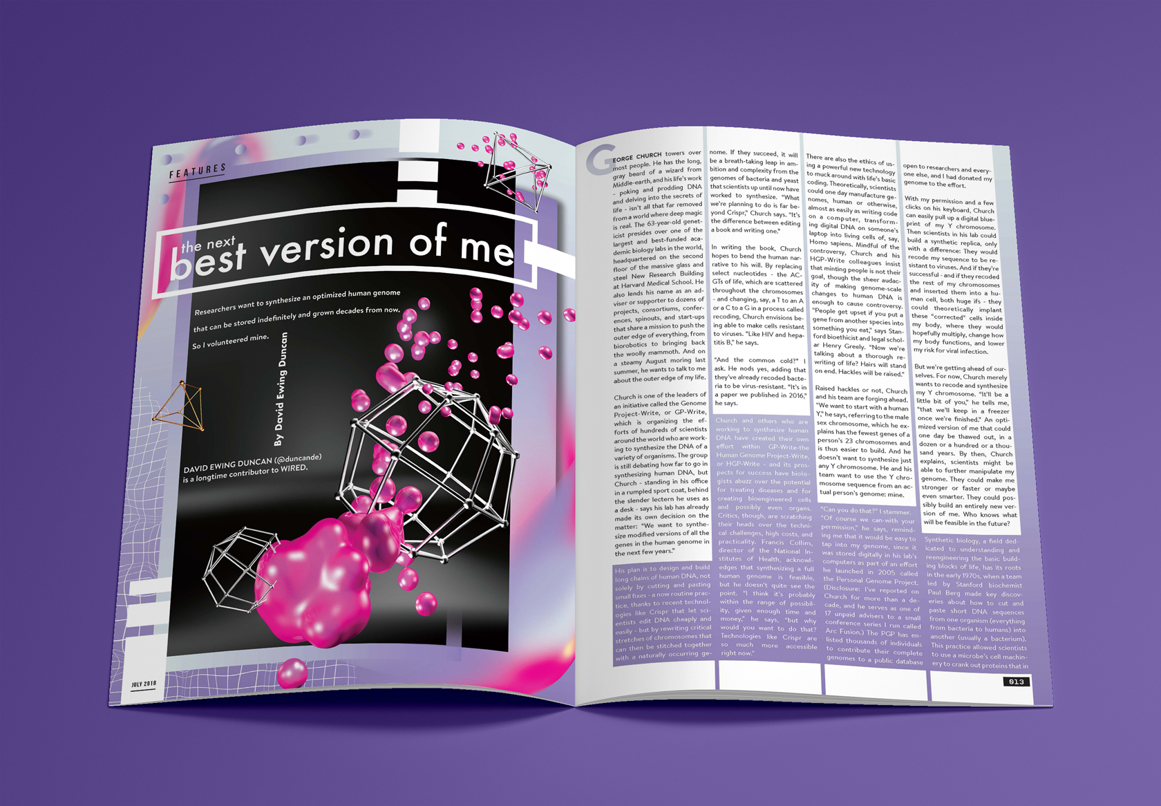
Research was done in order to fully understand the existing publication’s vision in order to apply an overall concept. The conceptual approach is futuristic and experimental. By applying different methods and ideas for the articles to create solutions, it aligns with WIRED Magazine’s content relating to advances in technology and science. Each article was examined individually to extract keywords and phrases that could be used to centre the choice of imagery created as well as the use of type.
For one of the articles of the magazine titled “A Whole New Word”, an icon set was created to be used within the final layout of the article. These icons are intended to signify each subcategory of the article provided such as “Hearing”, “Smell” and “Sight”. The concept of the icons is ‘senses at play’. The idea of ‘mapping’ is a symbolic depiction emphasising the relationships between elements in a space. By using the brain as a map, each icon shows which areas are activated when one of the senses are in play. This shows or navigates the relationship that specific sense has with the human brain and how it functions during those moments. Additionally, each icon includes a more obvious figure integrated to solidify the sense being represented.
Each section is meant to convey its own theme surrounding the contents of the article, by separating them with their own design style, colour usage, treatment for the type used, layout and structure while contributing to the publication as a whole. The final magazine was submitted as a high-quality print to provide a professional and realistic tactile mock-up that displays a complete magazine from start to finish.